
Your product is live, or nearly there. Someone asks for the logo for a partner page. Another person makes a social tile in a colour that is close, but not quite right. A dev picks a fallback font that changes the whole feel. Sound familiar?
That drift starts early. It is not a taste problem. It is a missing rules problem. Learning how to create brand guidelines means writing down choices once, so your team does not reinvent them under deadline pressure. Keep the document short enough to use, firm enough to settle rows, and owned by one person. That is the job.
Pick the logo first and you'll probably redo work later. I would build in this order instead, because each stage answers a question the next one depends on.
| Stage | Key question | Output | Sign-off owner |
|---|---|---|---|
| 1. Strategy | What does the brand promise, to whom, and how does it sound? | Purpose, audience and voice statements | Founder or CEO |
| 2. Name and mark checks | Is the name free to use and culturally safe? | Cleared name, logo variants, Nice classes, cultural review notes | Founder with IP adviser |
| 3. Visual identity | How do the logo, colour and type behave? | Spec sheet with master files | Designer |
| 4. Accessibility and localisation | Does it work for everyone and for local audiences? | Contrast, alt text and language rules | Designer and developer |
| 5. Governance | Who approves what, and when do rules change? | Owners, version number and exception route | Brand owner |
| 6. Rollout | Is the brand used consistently across channels? | Asset library, team training and first audit | Marketing lead |
Stages one and two get skipped most often. They feel slow. They save the most pain. A half day spent on a name, audience, and voice call beats a rebrand after you have printed signage, shipped app store art, and told partners a name you cannot keep.
There's a local wrinkle, too. InternetNZ research reported by LiveNews on NZ business digital use found that 53% of businesses had a website, meaning 47% did not. Plenty of small NZ firms get found first through a directory listing, an app store page, email, or a social profile. Your guide has to govern those small surfaces from day one, not just a polished homepage.
Practical rule: Name one owner for the whole document before design starts. If nobody owns it, everybody edits it.
Keep that six-stage table in your working doc. Tick a stage off only when its output exists and its sign-off owner has approved it. Not in Slack. In the doc. You know what? That tiny habit stops a shocking amount of drift.
A founder approves “fast and friendly” as the brand voice. A month later, sales writes “instant results” into a pitch deck, while the website promises something else. Settle the message before design starts, and give each decision a named approver.
Purpose. Complete this sentence: “We help [who] do [what] because [why].” Keep it concrete. “We help practice managers at small clinics cut follow-up admin because good care should not drown in paperwork” gives writers a clear direction. “We improve healthcare outcomes” does not.
Audience. Name two or three buyers by role and context, then record what each needs to believe before booking a demo. A practice manager at a small clinic in Hamilton may need confidence in reliability; a council digital lead may need a clear account of how the product works. Assign the marketing lead to draft the audience profiles and the product lead to confirm they are accurate.
Voice. Choose three adjectives and define the boundary for each: plainspoken, not jargon-heavy; warm, not matey; direct, not blunt. The boundary helps writers make consistent choices when a draft could go in several directions.
Approved words and proof. List preferred terms, words to avoid, and the evidence supporting each product claim. If sales says “saves hours” while product says “cuts manual entry,” agree on one accurate version. Have the relevant product or sales owner approve the wording before it goes into the guide.
Ask founders, operators, investors, and people who assess software for a living what makes a product seem trustworthy. Use their own language to shape two or three message routes. Test each route with the same audience, offer, and call to action, changing one element at a time so the results are useful.
Market research can help distinguish audience preferences from internal opinion. NZ Apps publishes editorial content on market research in New Zealand, which can provide local context as you decide what to investigate.
Set a baseline for unaided awareness, aided recognition, branded search, trust, and qualified demo conversion before launch. Remeasure at 30, 90 and 180 days. Smaller samples can fluctuate, so record the figures alongside the method and audience. Add the results and the reason for the chosen message to the guide, giving the next approver a clear basis for keeping or revising it.
A design review cannot tell you if a name is safe to use. It can only tell you if a name looks good in a deck. That gap catches founders out, and it is usually expensive when it does.
The IPONZ Year in Review 2019 to 2020 reported 25,741 trade-mark applications filed in 2019 to 2020, while 283,922 trade marks were on the New Zealand register. The same review found that only 39% of national trade-mark applications were preceded by a search for the same name. Consider that carefully. Many applicants skipped that check.
On that last point, IPONZ reported 1,006 applications referred to its Māori Advisory Committee in 2019 to 2020, with 38, or 3.8%, considered likely to offend Māori. That share is small. The harm from getting it wrong is not. Name a reviewer with real Māori expertise and make their sign-off a launch condition, not a courtesy.
Say a SaaS team approves a wordmark, briefs signage, and builds app store art. Then a search turns up a close registration in the same class, so the mark gets redrawn and every asset gets rebuilt. Compare that with a two-day check at the start. There is no clever trade-off here, just order of operations.
If you sell across the Tasman, run the same search on the Australian trade-mark register before the design brief goes out. Our own notes on intellectual property protection for tech businesses cover why that early search matters beyond the logo itself.
Put a cleared on date and a reviewer name on page one. It feels fussy. It will save you a very awkward meeting.
This is the part people bookmark, screenshot, and ignore in equal measure. Make it so clear that a new designer could rebuild your mark from the sheet alone, with no one hovering in Figma comments.
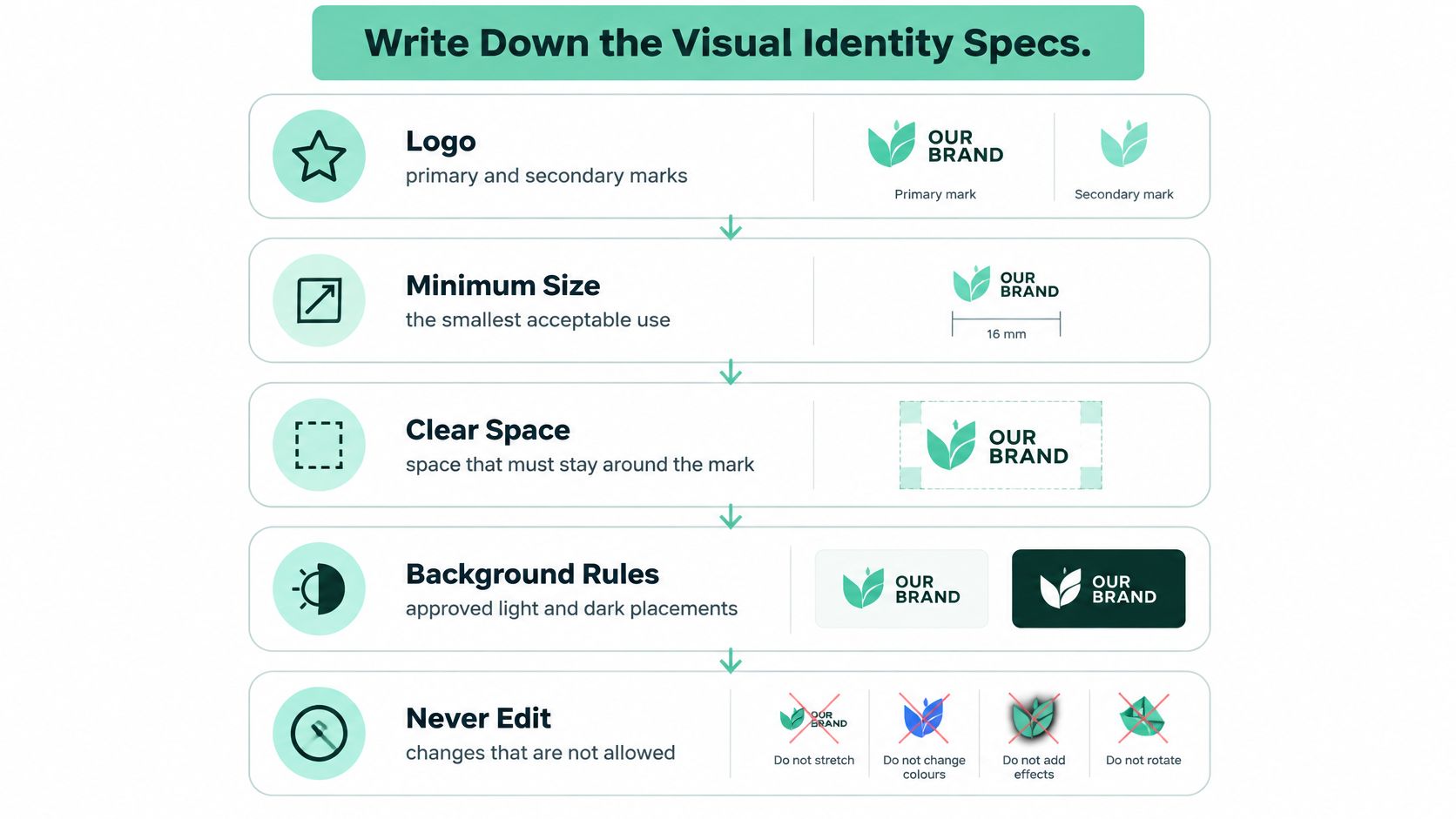
The Department of Internal Affairs is a good model, odd as that sounds for a startup. Its logos page and Visual Identity Guide points to a 19-page Visual Identity Guide and a controlled process for official logo requests. DIA also states the DIA logo and New Zealand Government logo must not be used in ways that infringe the Flags, Emblems, and Names Protection Act 1981. Government scale aside, the habit transfers neatly: write the specs, control the masters, give people one route to ask.
| Element | What to document | Why it matters |
|---|---|---|
| Logo | Primary and secondary marks, minimum size, clear space, banned edits | Stops stretched or cramped marks appearing across channels |
| Colour | HEX, RGB and CMYK values, plus the job of each colour | Keeps screens and print looking like the same brand |
| Typography | Heading and body typefaces, weights, sizes, fallback fonts | Holds layouts together when a font fails to load |
| Iconography | Grid size, stroke width, corner style, colour rules | Makes icons read as one family |
| Imagery | Photo style, crops, filters and approved subject matter | Keeps product and marketing images recognisably on-brand |
| Digital components | Buttons, cards, banners and states such as hover and focus | Lets product teams build without guessing |
| Master files | SVG for web, PNG for social, PDF for print | Prevents low-resolution or outdated logos going live |
State the primary mark, secondary marks, minimum size, clear space, and approved backgrounds. Then state the banned moves in plain words: do not redraw, recolour, or combine the mark without approval. Show three wrong examples next to that line. People copy pictures faster than they read rules.
For colour, give every swatch a job. Background, accent, body text, warning. A pretty teal with no job will wind up as body text on someone's slide, and you'll be the one squinting at it in a client meeting.
Typography needs heading and body faces, weights, sizes for web and print, and documented fallback fonts. If you want deeper help on how type rules hold up as teams grow, Font Checker Pro's notes on how to build scalable typography guidelines are a handy companion here. Pair that with the local thinking in our guide to New Zealand logo design when you settle the mark itself.
Icons need a grid size, stroke width, corner style, and a rule for when they take colour. Imagery needs photo style, crop habits, and subjects you will not use, like generic handshakes or US office shots that make a Kiwi firm look borrowed. Components need hover and focus states, since a button that only exists in its resting state is half designed.
A spec you cannot test is just a wish with better formatting.
Keep masters in one library with file names a human can read. If the correct file is harder to find than an old PNG in someone's Downloads folder, the old PNG wins. Every time.
"We'll fix it later" is where accessible brands go to die. Later means after launch, after the palette is loved, after the button colour is in every screenshot. Then a fix feels like a redesign, so it slips again.
There is a fixed line to work to. From 17 March 2025, the New Zealand Government Web Accessibility Standard 1.2 requires in-scope public-service and Executive-branch department webpages to conform to WCAG 2.2 at Level AA, subject to stated exceptions. Your startup may sit outside that scope, but the bar is still the right one to borrow, especially if you sell to government, health, education, or larger firms.
| Element | Threshold or rule |
|---|---|
| Standard text | 4.5:1 minimum contrast |
| Large text | 3:1 minimum contrast |
| Sentence length | Under 25 words |
| Heading order | Logical H1 to H3 sequence |
| Images | Descriptive alt text on every meaningful image |
| Video | Captions or transcripts |
Those numbers come from Auckland Transport style guidance, which follows the NZ Government standard. At least 4.5:1 contrast for standard text and 3:1 for large text. It also points to sentences under 25 words, a logical H1 to H3 order, alt text, and captions or transcripts. Specific beats sincere here.
Run this before release, every release:
A designer owns the visual asset. A developer owns what that asset means in code. Write that split down, or a mark can look right and read as nothing to a screen-reader user.
NZ Government guidance on its bilingual logo shows the detail nicely. Its logo markup guidance says the English and Māori text must be reinforced visually and identified programmatically for browsers and screen readers. In practice, one language sits in the image alt attribute, the other appears as visually hidden text, and a lang attribute tells assistive tools which is which.
Say your primary button is brand yellow with white text. It looks cheerful, and it fails a 4.5:1 check hard. The fix is not a debate about taste. The guide should name the approved darker shade for text-bearing buttons and keep the yellow for large decorative blocks. Decision made, argument over, users can read the button. Why leave that to chance?
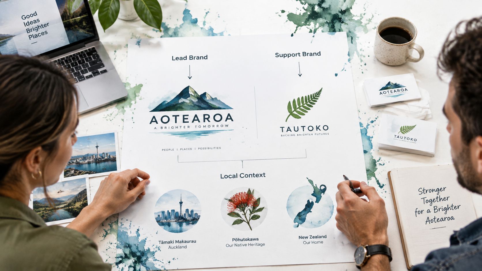
A partner directory crops your logo into a square. A sponsored article places it beside another company's mark. A local campaign adds a place name to the headline. Set the rules for each use before a partner or regional team has to guess.
Give every brand relationship a clear hierarchy: name which identity leads, which supports, and who approves the layout. Define permitted uses for partner pages, sponsored content, app store graphics, directory listings, and social profiles. If several teams publish under different brands, multi-brand editorial workflows with Narrareach offers a useful reference for structuring approvals.
A .nz domain can signal local relevance to NZ audiences. Keep the language and references accurate; adding Kiwi expressions for effect can make a brand feel less credible, not more.
Treat te reo Māori and place-based stories as part of the brief from the start. Record the preferred dialect, macron use, pronunciation for spoken content, and the person responsible for approval. A real partnership requires people, consent, and context. A motif chosen from a mood board does not establish any of those.
For example, a team might add a Māori phrase to a logo lockup to suggest local warmth, then find the wording does not suit the context. The lockup, signage, and app artwork may all need replacing. Early review by an appropriate language or cultural adviser gives the team a chance to correct the brief before design work is built around it.
Apply the same care to Australian partner and directory listings. Ask a reviewer with relevant expertise to check Indigenous terms before the design is final. A written approval step makes the responsibility clear and changes easier to manage.
A guide nobody maintains turns into folklore within months. New hires copy the file they can find. Freelancers guess. Someone updates a colour in Canva and tells no one. Governance sounds dull because it is dull, and it is also the difference between a system and a PDF.
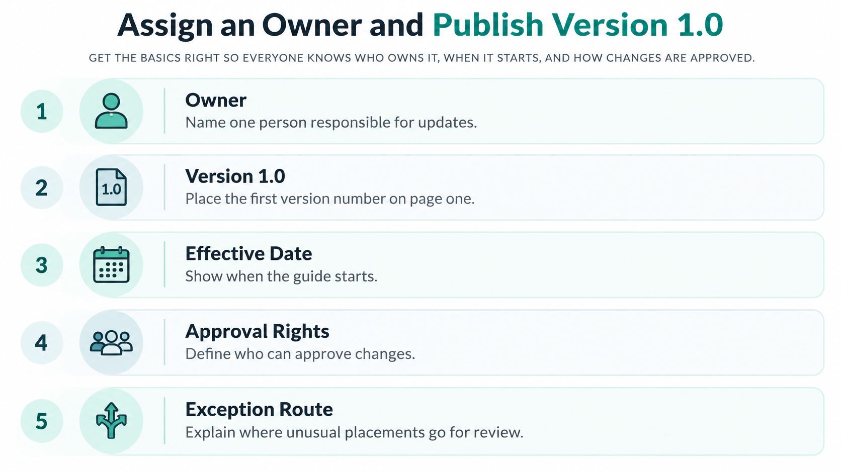
NZ Government guidance frames a design system as a catalogue of reusable parts, and its accessibility planning guidance supports validating products with semantic HTML, scannable hierarchy, descriptive links, accessible typefaces, and text alternatives for graphics. That is the right shape for your guide, too: parts people can build from, stored beside the rules for using them.
Audit every quarter across your website, app store pages, product UI, sales material, and social channels. Track four things your team can read at a glance: approved-asset rate, exception count, time to publish, and accessibility defects per release. If exceptions climb, your rules may be too tight for real work. That is useful, not shameful.
Now test whether the guide works. Give five internal users an unlabelled asset library and ask each person to build the same landing-page hero, app store graphic, and partner banner. Where their results drift apart, your wording is loose. Tighten it and test again, until people land in the same place without a designer rescuing them.
If five people produce five brands from one guide, the guide is the problem.
Add rules for AI-written copy, generated images, chatbot replies, and personalised offers. Adobe reported that formal generative AI deployment among surveyed ANZ brands rose from 14% in 2024 to 29% in 2025, in its Adobe report on ANZ brands and AI. Your guide cannot approve every output by hand at that pace. Set approved uses, banned uses, disclosure rules, prompt examples, and a human reviewer for anything sensitive.
Roll it out in order: owner named, specs published, templates built, training done, first audit booked. Training matters more than people think. We provide training after handover so clients can update text, swap out images, and add new blog posts themselves, and that habit saves weeks of waiting on tiny fixes.
This week, pick the owner and book the acceptance test. Just those two moves. The rest gets easier once a real person is on the hook.
If your logo, colours, and voice live in three folders and nobody is sure which file is current, we can help you turn them into a brand guidelines document your team will use across your site, app listings, and partner pages. Start with a free, no-obligation consultation for your website project, and visit NZ Apps to talk through what your version 1.0 should cover.
Add your NZ or Australian app or tech company to the NZ Apps directory and get discovered by founders and operators across the region.
Get ListedReach tech decision-makers across New Zealand and Australia. Sponsored and dofollow editorial links, permanent featured listings, and sponsored articles on a DA30+ .co.nz domain.
See Options