
A practical customer satisfaction programme combines a relationship metric, a task-level metric, and feedback from the channels customers actually use. New Zealand telecommunications satisfaction fell from 79% two years earlier to 69% by June 2025, so a single healthy-looking score clearly isn't enough.
That drop followed a low of 68% in December 2024, and it makes a useful point for every Kiwi SaaS founder. Customer satisfaction isn't a mood to check once a quarter. It's a signal system. You need to know whether customers are happy with the product, whether they can complete important tasks without friction, whether support keeps its promises, and where the journey breaks when they move between your app, website, and people.
The useful question isn't just, “Are customers satisfied?” It's, “Satisfied with what, through which channel, at what point, and compared with which expectation?” That shift changes how you collect feedback, how you read the numbers, and how quickly your team acts.
A single score can look calm while the customer experience is taking on water. New Zealand's Commerce Commission telecom tracking shows overall satisfaction fell from 79% two years before mid-2025 to 69% in June 2025, after reaching 68% in December 2024. The same Commerce Commission tracking report treats 80% or above as favourable, which makes the later result more than a small wobble.
That movement matters for SaaS teams because broad satisfaction scores often average together very different experiences. A customer may like the product but hate onboarding. They may praise the support agent but struggle with the billing screen. They may give a generous score after a quick fix, even though the underlying issue has appeared several times.
A score is a smoke alarm, not a fire investigation.
Founders often get into trouble by celebrating a stable monthly figure without checking who answered, what they had just done, and what happened next. If your most active users respond while quiet, frustrated customers ignore the survey, the dashboard can look healthier than the product feels.
For a more reliable feedback loop, connect satisfaction data with user testing guidance for NZ product teams, support themes, product usage, and renewal conversations. The aim isn't to create a grand analytics machine. It's to stop treating the final click in a journey as the whole journey.
A useful programme should reveal:
That is the difference between reporting satisfaction and managing it.
NPS, CSAT, and CES answer different questions. Treating them as interchangeable is like using a speedometer to check the fuel tank. The display may be impressive, but it won't tell you what you need to know.
NPS, or Net Promoter Score, asks how likely a customer is to recommend your app on a 0 to 10 scale. Promoters score 9 or 10, Passives score 7 or 8, and Detractors score from 0 to 6. NPS equals the percentage of Promoters minus the percentage of Detractors, as described in the Commerce Commission's customer satisfaction methodology. It suits a growth-stage SaaS company that wants a relationship-level view of advocacy and loyalty.
CSAT, or Customer Satisfaction Score, asks how satisfied someone was with a specific interaction. The NZ telecom method defines satisfaction as the share of respondents giving a 4 or 5 out of 5, a clear top-box approach rather than a fuzzy “happy or unhappy” prompt. CSAT works well after support resolution, onboarding, a feature interaction, or a purchase event.
CES, or Customer Effort Score, asks how easy it was to complete a task or get help. It comes into its own when onboarding, self-service, or support friction is a suspected churn driver. Product teams that need a deeper working guide can use this CES survey guide for product teams to shape the question and interpret the result.
| Metric | Best question | Useful moment | Main blind spot |
|---|---|---|---|
| NPS | Would you recommend us? | Relationship or milestone review | Doesn't isolate a recent problem |
| CSAT | How satisfied were you with this experience? | After a specific interaction | Can hide effort and longer-term loyalty |
| CES | How easy was it to complete this task? | Onboarding, support, self-service | Doesn't capture value or emotional response |
Choose the metric by the moment that matters most. If your worry is referrals and customer advocacy, make NPS primary. If your support team needs a fast read after each case, use CSAT. If new users abandon setup, CES deserves centre stage.
Then add one supporting metric. A high NPS means little if sign-up feels like wading through wet concrete. A strong CSAT after support can coexist with a confusing product. For a broader view of commercial consequences, connect the programme to customer lifetime value planning for SaaS teams, but don't turn every useful measure into another executive dashboard tile.
The simplest operating rule is this: one primary metric, one supporting metric, and one open text question. That gives your team a signal, a friction check, and a reason behind the score.
A poor question can spoil a good research programme. The wording, response options, and order all influence what customers tell you. Stats NZ's guide to good survey design warns that questions must fit the research objective, response options must fit the question, and question order can bias answers. It also flags large gaps between response options as a common design problem.
That sounds academic until a founder asks, “How easy was our new feature, and did it deliver good value?” A customer might find the feature easy but useless. Another might find it awkward yet valuable. Two questions have been bundled into one, and the result is mush.
Before writing a survey, state the decision the answer should inform. Are you trying to improve onboarding, assess a support resolution, test trust in pricing, or understand why customers aren't adopting a module? If the team can't name the decision, the survey probably isn't ready.
Keep the first question short and specific. Use plain language, consistent anchors, and one idea at a time. “How satisfied were you with the support you received today?” is easier to interpret than “How satisfied were you with the speed, clarity, and quality of our support process?”
A practical pre-launch check looks like this:
A post-experience survey captures a fresh memory. A survey sent long after the event often measures the customer's broader mood, a later problem, or whatever happened most recently. Use CSAT close to the interaction you want to understand, and use CES immediately after a task such as onboarding or finding an answer in self-service.
Don't mistake a longer form for richer evidence. One focused rating, one optional open text prompt, and useful context such as plan, role, product area, and channel will usually beat a sprawling questionnaire that customers abandon halfway through.

For NZ and AU SaaS teams, market research support for local product decisions can help when an internal user list is too narrow or heavily skewed towards power users. The core principle remains simple: design the question around the decision, then design the sample around the people affected by it.
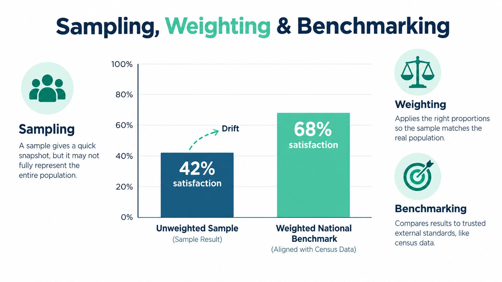
Small teams often send a survey to whoever happens to be active and call the result “customer satisfaction”. That approach is quick, but it can turn a product tracker into a power-user tracker without you noticing. If your most engaged customers answer more often than new, regional, lower-frequency, or recently frustrated users, the average won't represent the customer base.
NZ public research offers a useful pattern. MBIE's New Zealand Consumer Survey used 3,600 adults in 2026 and applied RIM weighting, while Commerce Commission telecom tracking used monthly samples of about 400 residential respondents rolled into a wider reporting window to steady the estimates. These methods are described in the New Zealand Consumer Survey report.
A SaaS company doesn't need a government research department to borrow the logic. Start by defining the population you want to describe. For a residential NZ product, that may mean setting quotas or reviewing results by:
Your own customer base won't mirror the national population perfectly, and it shouldn't. The point is to understand the difference between the people who answered and the customers you want the result to represent.
Weighting adjusts the influence of responses so over-represented groups don't dominate the result. It can make an internal tracker more useful, but it can't rescue a badly defined sample. If you have almost no responses from a vital group, a neat weighting spreadsheet won't create genuine evidence.
For a small programme, record the target distribution, compare it with completed responses, and flag large gaps before reading the top-line score. Use interlocking quota cells when the programme needs more control across combinations such as region and age. They help prevent a sample that looks balanced on each variable separately but is lopsided when variables meet.
Don't weight to make the number look better. Weight to make the number describe the population you named.
Keep the method consistent across reporting periods. If you change the sample source, survey trigger, question wording, or weighting approach, mark the change in the trend line. Otherwise, a movement in satisfaction may reflect a change in measurement rather than a change in the customer experience.
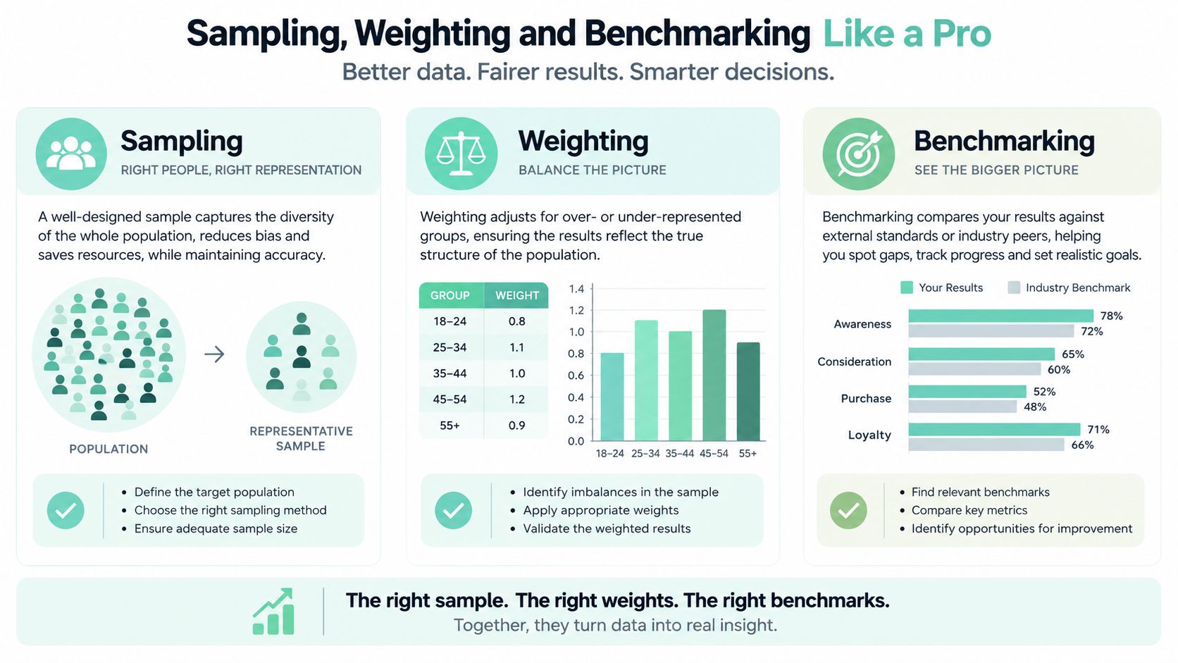
The practical rule for founders is blunt: don't let active power users become your accidental research panel. Keep a clean record of who was invited, who replied, how responses were weighted, and which segments were missing. That audit trail is more valuable than a polished chart with no method behind it.
Overall satisfaction can hide a handover problem. A customer might enjoy the app, struggle with the website, then wait for support to explain something the product should have made clear. If all three moments become one average, the weak link disappears.
New Zealand public-service data makes the point clearly. In June 2026, 81% of Kiwis were satisfied or very satisfied with their most recent government service. Digital-only interactions scored 85%, compared with 79% for non-digital and 78% for mixed-channel experiences, according to the Kiwis Count data from the Public Service Commission.
The lesson for SaaS isn't that digital always wins. It is that channel changes the experience. A digital-only journey may be quick and clear, while a mixed journey may expose a broken handoff between product, help centre, chatbot, and human support.
Capture the context around each response. Useful fields might include:
Don't collect every field merely because your platform makes it possible. Choose the context that can change a product or support decision. If your team is trying to improve onboarding, stage and task matter more than a long list of demographic fields. If the complaint concerns support, channel, handovers, and resolution status matter more.
Suppose the overall score looks stable, but mixed-channel users give weaker feedback than app-only users. That doesn't automatically mean support is failing. It may indicate unclear escalation rules, inconsistent answers, a missing feature in the help centre, or a customer who had to repeat the same story.
Ask the open question in a way that exposes the moment: “What made this task harder than expected?” Then tag responses by theme. “Couldn't find the setting” points to discoverability. “Had to explain it twice” points to handover quality. “The reply said one thing, the app did another” points to promise-keeping.

The average still has a place, but it should be the map legend, not the destination. Segment first, interpret second, fix third.
Collecting feedback feels productive. Acting on it is the part that changes retention. A survey that disappears into a spreadsheet teaches customers that responding is a waste of their time.
Start with a simple triage model. Detractors need a prompt response because frustration can spread or turn into quiet disengagement. Promoters deserve thanks and, where appropriate, a chance to share a referral or product story. Passives need more careful handling. Their score may look harmless, but their written comment can reveal a specific issue worth fixing.
The follow-up must sound human when the problem is human. Accenture Song's New Zealand study found 18% of consumers were frustrated by being stuck with automated chatbots, while 69% believed brands weren't keeping their promises, as reported by IT Brief NZ's coverage of the study. Those findings make a strong case for measuring promise-keeping, self-service failure, and escalation friction alongside NPS or CSAT.
When a negative signal arrives, run a clear sequence:
The timing matters, but speed isn't the whole answer. A fast, empty reply can irritate someone further. “We hear you” without a next action is just a softer form of silence.
Practical rule: Every negative response should produce either a customer action, a product action, or a documented reason why neither is possible.
Promoters also deserve attention. Thank them, ask what they value, and use their language when refining onboarding or positioning. Don't turn every positive response into a sales request. That makes appreciation feel like a trap.
Track whether the promise was kept. Did the feature work as described? Did support do what it said? Could the customer solve the issue without a human handover? Did an escalation end with a clear outcome? These measures often explain a satisfaction movement more clearly than another round of broad scoring.
The closed loop is complete only when the customer can see what changed. That might be a fix, a clearer explanation, a better help article, or an honest statement that the request isn't on the near-term roadmap. Candour counts. Customers can handle “not yet” more easily than vague reassurance followed by silence.
A small SaaS team can run a useful quarterly programme without building a research department. Start with the commercial question. If the company wants to understand advocacy and relationship health, use NPS as the growth signal. Add CSAT after support or a key product event so the team can inspect specific experiences rather than asking one broad question to do every job.
Write the questions around decisions, not curiosity. Keep the wording neutral, split double questions, and include one open text prompt. Before sending, check who will receive the survey and whether the sample reflects the NZ users the team wants to understand. If the audience is uneven, apply sensible quotas or weighting and record the method.
Then read the results by journey. Compare digital-only users with customers who moved between the app, website, and human support. Separate onboarding from mature usage. Look at the product area and support path. A high relationship score can sit beside a miserable integration flow, and a solid support score can hide a billing promise that customers no longer trust.
Picture a Kiwi SaaS team reviewing its latest results. NPS is steady, but CSAT after onboarding has weakened. The written comments show that users understand the product's value, yet many can't tell whether an integration has finished syncing. Mixed-channel customers mention repeating details to support, while app-only users rarely raise the issue.
The team doesn't announce a vague “customer experience initiative”. It assigns an owner to the integration status message, tests the onboarding flow with users, reviews the support handover, and follows up with people who reported the problem. The next survey checks whether the task became easier and whether the promise made during onboarding now matches delivery.
For adjacent ideas on support workflows and automation, the SupportGPT-1 article list offers a useful pool of reading, but tools won't replace judgement. The habit matters more than the dashboard: measure a specific moment, understand its context, act on the signal, and tell customers what happened.
That is how to measure customer satisfaction without turning it into theatre. The score starts the conversation. The journey explains it. Follow-up proves whether the business listened.
NZ Apps publishes practical coverage of SaaS, apps, AI, and tech companies across New Zealand and Australia, including research-led resources for founders and operators. Visit NZ Apps to explore its directory, regional market content, and opportunities to connect your product with the NZ and AU technology audience.
Add your NZ or Australian app or tech company to the NZ Apps directory and get discovered by founders and operators across the region.
Get ListedReach tech decision-makers across New Zealand and Australia. Sponsored and dofollow editorial links, permanent featured listings, and sponsored articles on a DA30+ .co.nz domain.
See Options