Your ecommerce homepage is your digital front door. It has to immediately tell visitors who you are, what you sell, and why they should care. A great homepage mixes smart branding, easy-to-use navigation, and clear calls-to-action to turn window shoppers into loyal customers.
Honestly, think of your homepage as your best salesperson, your front-of-house greeter, and your brand ambassador all rolled into one. It’s the first impression most people will get of your business, and you have only a few seconds to make it count. Does it feel welcoming? Does it instantly tell people they're in the right place?
This is where so many businesses fall down. They treat their homepage like a pretty, static brochure instead of a dynamic, powerful tool. But your homepage has a job to do—several jobs, in fact. It needs to guide, persuade, and ultimately, convert. For Kiwi businesses especially, this first interaction is critical for building that initial trust and standing out from the crowd.
Before you even start thinking about colours or fonts, you need to ask yourself a tough question: What do I really want my homepage to achieve? What is its number one job?
It might not be as simple as "make a sale." Your primary objective could be something else entirely, and that one goal should steer the entire design.
Of course, you can have secondary goals, but choosing a single primary objective brings incredible clarity. It stops your homepage from becoming a cluttered mess where everything is screaming for attention and nothing gets heard. A focused design is always a more effective design.
Your homepage isn't a storage closet for every link on your site. It's a curated experience designed to lead visitors towards a specific, valuable action. Getting this right is the foundation of a successful ecommerce website homepage design.
Okay, let's talk numbers, but in a way that doesn't sound like a dry marketing lecture. How do you know if your homepage is actually doing its job? You need to look at the data—but only the data that tells you a real story.
Forget about vanity metrics like total page views. Instead, focus on these three:
In New Zealand's booming e-commerce sector, which is projected to hit NZD 8.5 billion in revenue by 2025, getting this right pays off. For many Kiwi businesses, investing in a conversion-focused homepage design—which can be priced from NZD 8,600 to NZD 20,000—directly boosts sales by making the customer journey simpler.
To truly make your homepage a hard-working employee, it's vital to implement the best ecommerce website design strategies that are proven to drive revenue.
That massive banner at the top of your homepage? The one with the stunning image and a punchy headline? That’s your hero section, and honestly, it has one of the most important jobs on the entire website. It's your digital handshake, your first impression, and you have about three seconds to get it right.
It needs to grab attention and tell your story in a heartbeat. What are you selling? Why should anyone care? And what should they do next? This part is all about nailing that first impression and making an immediate connection.
A great hero section isn't just a pretty picture; it's a strategic mix of a few key ingredients. When they all work together, they create a powerful, immediate connection that convinces visitors to stick around. A sloppy hero section, on the other hand, is a one-way ticket to a high bounce rate.
You know what? It all boils down to these must-haves:
This is where so many businesses stumble. They try to be too clever and end up being confusing. The best hero headlines are simple, benefit-driven, and speak directly to a customer's pain point or desire. It's the difference between "Artisanal Hydration Solutions" and "Handcrafted Water Bottles That Keep Your Drink Cold for 24 Hours." See the difference?
Your headline should instantly answer the "What's in it for me?" question from the customer's perspective. It needs to be less about what you sell and more about the problem you solve.
A killer headline isn’t about being witty; it’s about being understood. If a visitor has to spend more than a couple of seconds figuring out what you do, you’ve probably already lost them. Clarity always wins.
Let’s be real, crafting this balance of compelling copy and visuals can be tricky. It requires a deep understanding of user behaviour and design principles. Getting help from a specialist UI/UX design consultant can make a huge difference, turning a good hero section into a great one that truly performs.
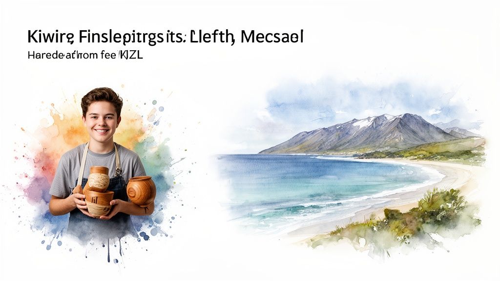
You don't have to look far to see some great examples right here in Aotearoa. Take a brand like Allbirds. Their homepage hero often features their shoes in a natural, quintessentially Kiwi setting. The headline is usually simple, focusing on comfort or sustainability—their core value propositions. The CTA is always a clear, unmissable button like "Shop Men" or "Shop Women." It’s direct, visually appealing, and incredibly effective.
Another great example is Fix & Fogg. Their hero section is a celebration of their product. It’s all about mouth-watering visuals of their peanut butter, often paired with a headline that speaks to flavour and quality. The design feels authentic, local, and makes you want to grab a spoon. These brands understand that an effective ecommerce homepage isn’t just about aesthetics; it’s about telling a compelling story from the very first click.
Now that we have their attention, let's make sure they can find things. Ever landed on a website and felt completely lost? It’s beyond frustrating, and it’s honestly the fastest way to lose a potential sale. This is where we talk about creating a clear, simple path for your customers through smart navigation and a powerful search function.
Here's the thing: good navigation isn't just a menu bar; it's a map of your entire store. It needs to be intuitive, logical, and designed for your shopper, not just for you. A confusing map leads to a lost customer, and a lost customer clicks away.
This is a massive opportunity, especially in New Zealand. Can you believe that only 53% of NZ businesses are expected to have a website by 2025? That figure hasn't changed since 2022, even as customer expectations for smooth online experiences have skyrocketed.
For the other half of businesses just catching up, a brilliant ecommerce website homepage design is a massive competitive advantage. Getting this part of your design right—making your site easy to navigate—is a simple way to stand out. Find out more about how Kiwi businesses are adapting (or not) in this revealing local data analysis.
Think about how you’d lay out a physical shop in Christchurch or Auckland. You wouldn’t just throw products randomly onto shelves, would you? Of course not. You’d create aisles and sections that make sense—men's clothing here, kitchenware over there.
Your website's navigation needs that same level of common-sense organisation.
Your product categories should be intuitive and use language your customers understand. "Footwear" is fine, but breaking it down into "Boots," "Sneakers," and "Sandals" is even better. It’s all about reducing the number of clicks it takes for someone to find what they're looking for.
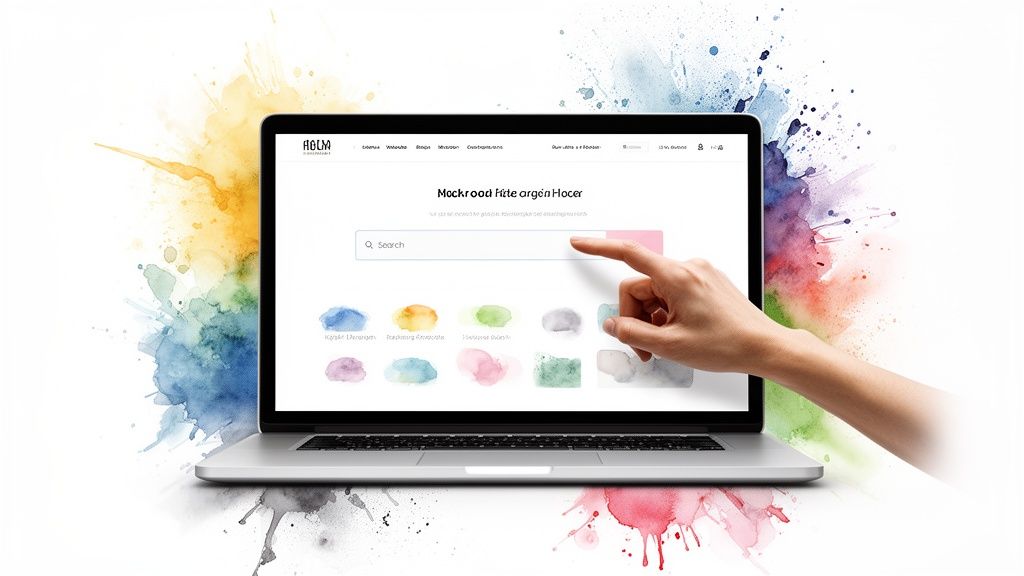
Now, let's talk about the search bar. If your navigation is the map, your search bar is the friendly shop assistant who knows exactly where everything is. It’s a game-changer, especially if you have a large or complex inventory.
But not just any search bar will do. You need a ‘smart’ one. What does that even mean?
Honestly, your search bar isn't just a utility; it's a conversation starter. When a customer types something in, they're telling you exactly what they want. A powerful search function listens and delivers, making the path to purchase incredibly smooth.
To help you decide what’s right for your store, here’s a quick comparison of the most common navigation elements and what they're for.
| Navigation Element | Primary Purpose | Ideal For |
|---|---|---|
| Main Menu (Header) | Provides top-level categories that give an overview of your entire product range. | Every single ecommerce store, no exceptions. This is your primary map. |
| Dropdown Menus | Shows sub-categories without the user needing to click away from the homepage. | Stores with a moderate to large number of product types that fit into clear groups. |
| Search Bar | Allows users with high purchase intent to find specific products quickly. | Essential for stores with more than 20-30 products; a must-have for large catalogues. |
| Footer Navigation | Offers links to important but less-trafficked pages like 'About Us' or 'Returns Policy'. | All stores. It keeps the main header clean while providing access to key info. |
Ultimately, the goal is to make product discovery feel effortless. You want your customers to feel guided, not overwhelmed. By combining clear, logical navigation with a forgiving and intelligent search bar, you create an intuitive shopping experience that builds confidence and, most importantly, drives sales. It makes your homepage feel less like a maze and more like a welcoming, well-organised shop.
Let's be honest, people buy from businesses they trust. It’s such a simple truth, but it’s amazing how often it gets overlooked in the mad rush to get a website live. Your homepage is where that trust-building process begins. It’s not just about having a secure checkout page later; it’s about signalling credibility from the very first glance.
Think about it like this. When you walk into a physical shop, you’re subconsciously picking up on dozens of cues—the cleanliness, the friendly staff, the professional signage. Your homepage has to do the digital equivalent of all that heavy lifting. Are you a real, legitimate business, or just a slick-looking facade? That's the question running through your visitor’s mind, and your design needs to answer it with a resounding "Yes, you're in safe hands."
"Social proof" is just a fancy marketing term for something we all know intuitively: people trust what other people trust. It’s why we read reviews before trying a new cafe. Your homepage is the perfect place to put this powerful psychological principle to work.
And I don't mean burying a link to a testimonials page in your footer. This needs to be front and centre, woven right into your ecommerce website homepage design.
For businesses here in New Zealand, being local is a huge advantage. Shoppers genuinely prefer to support local, but they need to know you are local. Your homepage needs to scream "We're right here in Aotearoa!"
This isn’t about being flashy; it’s about providing clear, reassuring signals that you’re a legitimate, on-the-ground operation.
When a visitor can see there are real people and a real place behind the website, their guard comes down. This subtle shift is often the difference between a bounce and a browse.
You should consider adding these elements somewhere obvious on your homepage—often in the header or footer:
0800 or a regional number is a massive trust signal.All these details work together to build a picture of a trustworthy local business. They turn your anonymous website into a relatable brand that people feel good about supporting. Without them, you’re just another faceless site on the internet, and that’s a tough place to be. Your ecommerce homepage design is your first and best chance to prove you’re the real deal.
So you’ve designed a stunning homepage. It looks the business, tells your story, and builds trust. But what good is all that hard work if no one can find it, or if it takes an eternity to load?
Honestly, this is where the more technical stuff comes in, but don't worry, we'll keep it straightforward. Think of it like tuning up your car's engine; it might not be the most glamorous part of ownership, but it’s absolutely essential for getting you where you need to go. Without it, you're just a pretty car stuck in the garage.
We need to talk about two things that can make or break your online success: how visible you are to search engines (SEO) and how fast your page loads (performance).
Search Engine Optimisation, or SEO, is really just a fancy way of saying "making it easy for Google to understand what your website is about." When Google gets it, it can show your homepage to potential customers who are actively searching for what you sell. For any ecommerce website homepage, this is completely non-negotiable.
You don't need to be a tech wizard. Just focus on getting the basics right:
For Kiwi businesses, local SEO is huge. You want to send strong signals to search engines that you're based right here in Aotearoa. Mentioning your city, using a .co.nz domain, and getting listed on local directories all help Google connect you with local shoppers.
Let's be real, nobody waits for a slow website. We've all been there—you click a link, the little wheel spins, and after a few seconds, you're gone. Patience is not a virtue on the internet, especially when people are browsing on their phones.
How slow is too slow? Research shows that a delay of just one second in page load time can lead to a 7% reduction in conversions. That’s a massive hit to your bottom line.
A fast, responsive homepage isn't a luxury; it's a fundamental part of the customer experience. A slow site feels unprofessional and untrustworthy, sending potential customers straight to your competitors before they’ve even seen your hero section.
Your website's performance is deeply connected to its hosting. A great design on a poor hosting plan is like putting a race car engine in a rusty Lada—it's just not going to perform. If your site is sluggish, it might be time to look into a reliable website hosting New Zealand provider that can handle the demands of a modern ecommerce store.
So, what can you actually do to speed things up? Luckily, some of the biggest wins are pretty simple to implement. The main culprits for slow sites are usually bloated images and clunky code.
Ultimately, a well-optimised homepage contributes significantly to a better user experience, which in turn leads to higher sales. To dig deeper into this connection, you can learn more about how to improve ecommerce conversion rates with some modern insights. It’s all connected: visibility gets people to your site, and speed keeps them there.
Right, we're on the home stretch. Before you hit that big, tempting 'publish' button, it’s time for a final once-over to make sure nothing crucial has slipped through the cracks.
Think of it as the final walkthrough before you open the doors to your brand-new digital shop. This isn’t about chasing some mythical idea of perfection; it's about catching any glaring issues and setting yourself up for success from day one. Let's make sure all your hard work is about to pay off.
Your homepage might look absolutely stunning on your big desktop monitor in Auckland, but what’s it like for someone scrolling on their phone in Christchurch? Responsive design isn’t just a techy buzzword; it’s non-negotiable. With more than half of all web traffic now coming from mobile devices, a clunky, slow mobile experience is a surefire way to lose customers before they’ve even seen your products.
So, grab your phone. Grab your tablet. Borrow your partner’s slightly older, slightly slower phone. Check everything:
This simple, multi-device check can uncover some really surprising—and often very easy-to-fix—problems.
This process highlights the key things to check before you go live: making sure your site can be found (SEO), loads like a rocket (Speed), and is dialled in for your local customers (Local).
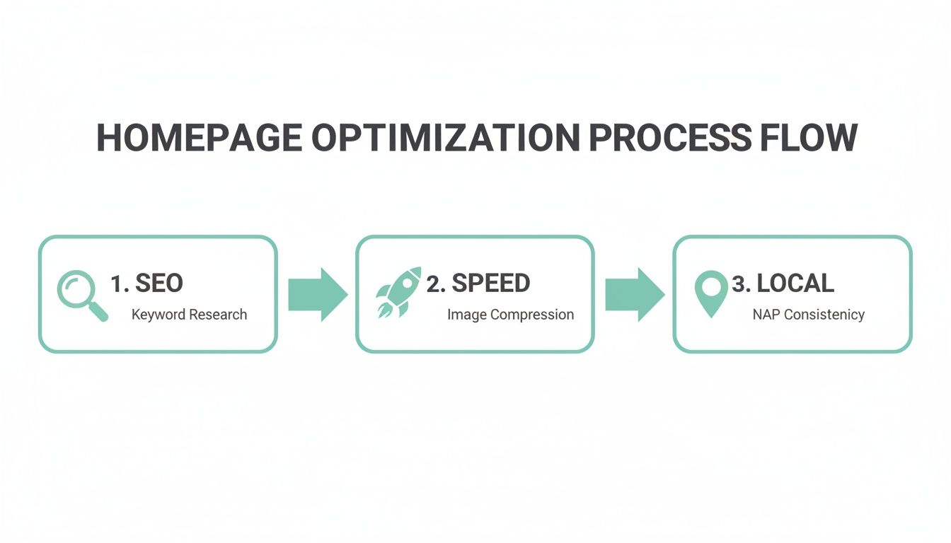
Ultimately, this whole flow is a reminder that a great launch isn't just about pretty design. It's about having a technically solid foundation that actually supports the user and helps them buy from you.
Look, you don't need to get this 100% perfect right out of the gate. That's what A/B testing is for. It’s a pretty simple concept: you create two versions of a single element—say, a headline or a button colour—and show version A to half your visitors and version B to the other half. Then you just sit back and see which one performs better.
Don't guess what your customers want. Let them show you. A/B testing takes the ego out of design and replaces it with real data, leading to decisions that actually improve your conversion rate.
You can test almost anything, from the text on your main call-to-action ("Shop Now" vs. "Explore Our Collection") to the hero image you're using. Tools like Google Optimize or VWO make this surprisingly easy to set up. My advice? Start small, test just one thing at a time, and let the data guide where you go next.
Alright, let's talk about some of the questions that pop up whenever we start a homepage design project. It's a big job, and it’s totally normal to have a few things you're wondering about.
Think of this as a quick chat over a flat white—just some straight, practical answers to the most common questions we hear from Kiwi businesses.
This is always the first question, isn't it? And honestly, the answer is: it depends. For a professional, custom-designed homepage in New Zealand, you could be looking at anywhere from NZD 4,300 for the core UI/UX work, right up to NZD 20,000 or more for a really in-depth, conversion-focused project.
So, what's behind that big range? It all comes down to the level of detail. A larger investment means we're covering everything from comprehensive wireframing and prototyping to making sure every single pixel is perfect for your mobile customers—a non-negotiable part of the Kiwi market.
The best way to think about it is as an investment in your most important salesperson, not just another business cost. A great homepage really does pay for itself.
Fantastic question. If we had to boil it all down to just one crucial element, it would have to be the hero section. That's the big banner right at the very top of the page.
It has to instantly answer three vital questions for anyone landing on your site for the first time:
Getting your value proposition crystal clear with a compelling call-to-action right there in the hero section can be the single biggest factor in whether someone sticks around or hits the back button. Nail this, and you’re already miles ahead.
Your hero section is your three-second elevator pitch. It has to connect instantly. If it’s confusing, vague, or boring, you’ve lost a potential customer before they’ve even scrolled.
You definitely don't need to do a massive, ground-up redesign every single year. That would be completely exhausting and a poor use of your budget. Your homepage should feel alive and current, not like something set in stone.
We recommend making small, intelligent updates based on real data and what's happening seasonally. This means regularly updating your featured products, refreshing your hero banner for big events like Christmas or Matariki, and testing out new calls-to-action.
A major overhaul? That's something you'd typically look at every 2-3 years, or if your business goes through a major rebrand. The goal here is constant improvement, not constant reinvention.
Ready to build an ecommerce homepage that not only looks brilliant but actually converts browsers into buyers? The team at NZ Apps specialises in creating bespoke website designs for Kiwi businesses. Get in touch for a free consultation and let's build something amazing together.